Every young person of today sooner or later meet the need to design something. Presentations in school, infographics for classes, own blog or website. To do all of it good enough we should have some basic knowledge of design. We asked Youth Time Art Director Alexandros Chouliaras to share few tips on how to be trendy in graphic design.
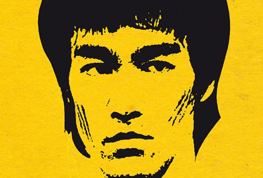
You want to know if there is a secret recipe for good design or how you can become a great designer? Well: “You must be shapeless, formless, just like water. When you pour water in a cup, it becomes the cup. When you pour water in a bottle, it becomes the bottle. When you pour water in a teapot, it becomes the teapot. Water can drip and it can crash. Be water my friend.” This quote by Bruce Lee is not far from Charles Darwin’s theory of evolution: “It is not the stronger of the species that survives, nor the most intelligent that survives. It is the one that is most adaptable to change”.
To become a great designer is not about talent or skills, it is all about adapting to every single project’s needs. Studies and work experience are a good background, but without constant research and education there is no evolution. Furthermore, design was never Lone Ranger in the Wild West, design was always influenced and driven forward by technology. The advent of smartphones and tablets with varied screen ratios, “the less is more” ideal, simplicity and clarity as a dogma for smartphones, became the guidelines for the design trend of the present.
Everything is adapted to flat design, visual clarity with big images and interactivity. It has been there for a few years already, people like it, designers have adapted and evolved. Below are five of the design trends for 2015 that could inspire you and perhaps, help you to predict what is to follow.
Flat Design Once Again
The old king of design trends doesn’t want to leave us. Once again there will be no shadows, no gradient, no realism. Flat colors, flat vectors, flat everything will prevail. Like it or not, the sure thing is that the time for heritage is close by.
Full-screen Motion images
It’s not new, but this one seems to be becoming more and more popular. With faster broadband Internet speeds that contribute to uploading higher quality images, you can’t miss, and for sure, not enjoy the plethora of options offered.
Beautiful Typography
Finally, you can see some good old school typography out there. Better visual hierarchy, calligraphic fonts and strong statements. Hardcore graphic design is back.
Freehand Illustration Never Dies
Balance is everything, and nothing can balance a flat design better than a freehand illustration. From a simple smudge straight through to photorealism, anything could do the job. Freehand illustration gives life and character to a design, what else could be asked for?
Interactivity
Interactivity is what to ask for. To involve the viewers one way or another gives pleasure to them. Keeps them interested, some would say important. Well, they are.
Pictures, motion, interactivity, they can all work together well. How well is up to you. Welcome the change, adapt and evolve. Good design is never an accident.
If you have any questions or would like to get an advise from the professional designer, e-mail us. Please mention in subject line “Question for Alex”.
Support us!
All your donations will be used to pay the magazine’s journalists and to support the ongoing costs of maintaining the site.
Share this post
Interested in co-operating with us?
We are open to co-operation from writers and businesses alike. You can reach us on our email at [email protected]/[email protected] and we will get back to you as quick as we can.


